analyzing the evidence
Making Sense of Charts and Graphs
Throughout this book, you will encounter graphs and charts that show some of the quantitative data that political scientists use to study government and politics. This section provides three general steps to help you interpret and evaluate common ways data are presented—both in this text and beyond.
Step 1: Identify the Purpose of the Graph or Chart
When you come across a graph or chart, your first step should be to identify its purpose. The title will usually indicate whether the purpose of the graph or chart is to describe one or more variables or to show a relationship between variables. Note that a variable is a set of possible values. The variable “years of education completed,” for example, can take on values such as “8,” “12,” or “16.”
If a graph is descriptive, you should identify the variable being described and think about the main point the author is trying to make about that variable. In Figure A, we see that party identification can take on one of three values (“Democrat,” “Independent,” or “Republican”) and that the author has plotted the percentage of survey respondents for each of these three values using vertical bars. The height of each bar indicates the percentage of people in each category, and comparing the bars to each other tells us that more Americans identified as Independents than either Republicans or Democrats in 2021. This is one main takeaway from the graph.
figure A Party Identification in the United States, 2021

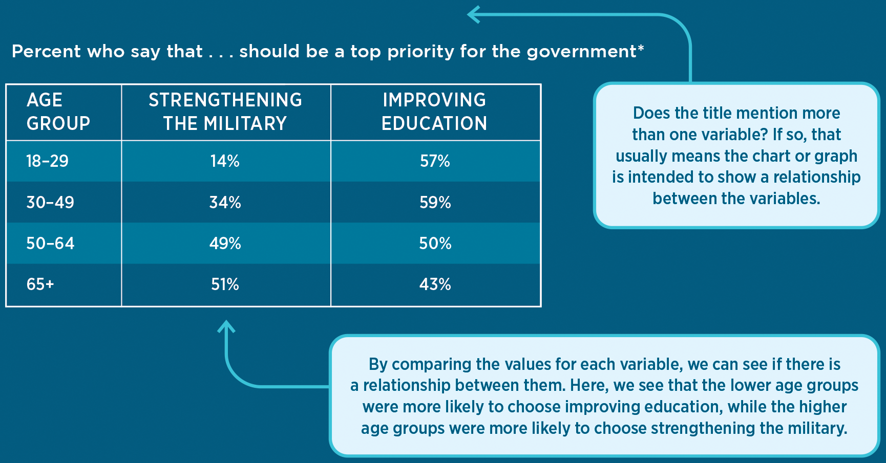
table A Policy Priorities by Age Group

* Respondents were allowed to pick more than one option.
The first column in Table A displays the values for age group, which in this case are ranges. The other columns provide data about policy priorities; they display the percentage of survey respondents in each age group who said that “strengthening the military” (in the second column) and “improving education” (in the third column) should be among the government’s top priorities. We can compare the columns to determine if there is a relationship between age and policy priorities. We see that a greater percentage of respondents in the higher age ranges said that strengthening the military should be a top priority; in the oldest age group (65+), 51 percent of respondents would have the government prioritize strengthening the military compared to 14 percent in the youngest age group (18–29). In the lower age groups, more respondents said that improving education should be a top priority. This is strong quantitative evidence of a relationship between age and policy priorities, which is the main point.
Step 2: Evaluate the Argument
After you’ve identified the main point of a graph or chart, you should consider: Does the graph or chart make a compelling argument, or are there concerns with how the evidence is presented? Here are some of the questions you should ask when you see different types of graphs.
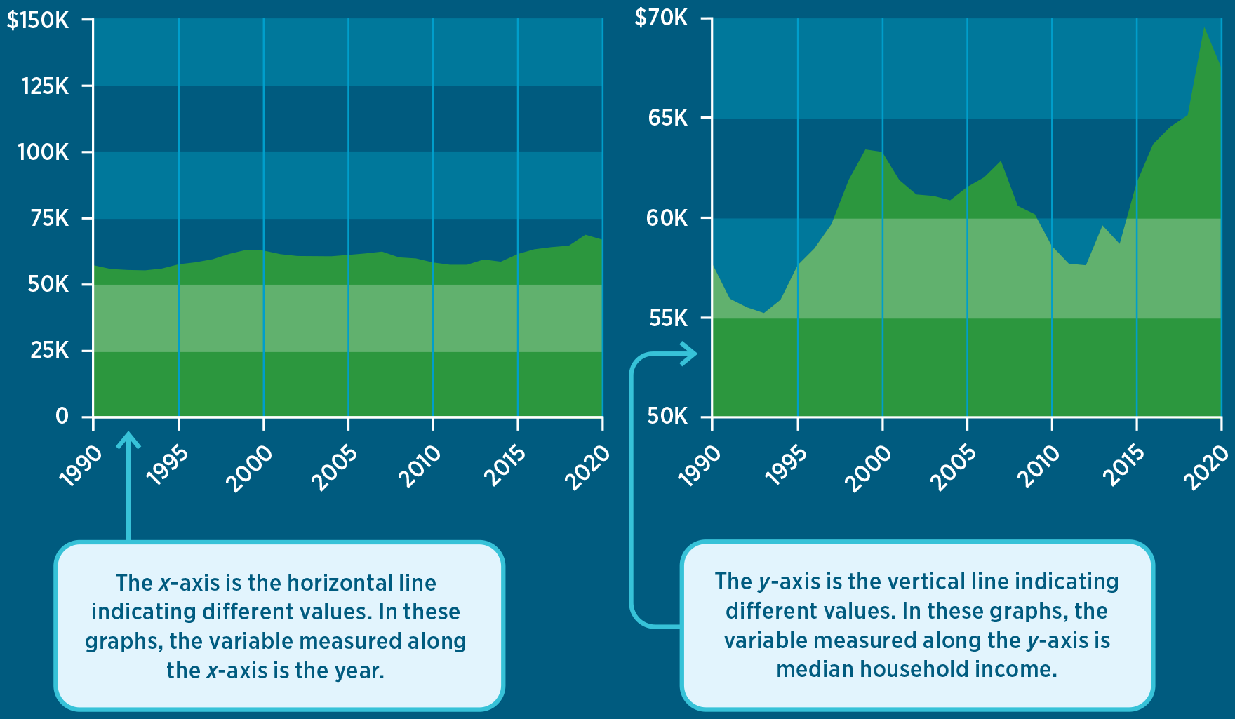
Figures B and C present exactly the same data but on graphs with very different y-axes. Both graphs plot median U.S. household income from 1990 to 2020. In the first graph, the range of the y-axis is so large that it looks like household income has barely changed over the past 30 years. In the second graph, the range is more appropriate. The second graph highlights meaningful changes in a household’s purchasing power over this time period.
Median Household Income Over Time

For example, in the 2020 presidential election, pollsters were interested in measuring the importance of various policy issues to voters. Some surveys asked respondents how important each of a series of policy issues would be to their vote decision—for example, “How important, if at all, are each of the following issues in making your decision about who to vote for in the 2020 presidential election?” Other surveys listed a set of policy issues and asked respondents to select which one of them was the single most important factor in their vote decision. Both approaches captured the importance of different policy issues to vote choice, but they did so in different ways.
Figures D and E are pie charts that illustrate the data from two surveys. The difference in how the graphs portray the importance of, say, health care to voters is striking. The first graph, “Influential Policy Issues,” based on the survey in which respondents were asked to select all issues that were very important to them, indicates that health care is an important factor for 68 percent of the voters surveyed. In contrast, the second graph, “The Most Important Policy Issue,” shows that when respondents were asked to select one policy issue from the given options, only 11 percent selected health care as the most important factor for their vote choice.
Top Policy Priorities, 2020
figure D Influential Policy Issues
figure E The Most Important Policy Issue

This example demonstrates why a pie chart is a poor graph choice for a variable in which the response categories do not add up to 100 percent. In choosing what type of graph to use, researchers and authors have to make thoughtful decisions about how to present data so the takeaway is clear and accurate.
Other times, two variables might move together, but these movements are driven by a third variable. In these cases, the two variables are correlated, but changes in one variable do not cause changes in the other. A classic example is the relationship between ice cream consumption and the number of drowning deaths. As one of these variables increases, the other one does too, but not because one variable is causing a change in the other one—both variables are driven by a third variable. In this case, that third variable is temperature (or season). Both ice cream consumption and drowning deaths are driven by increases in the temperature because more people eat cold treats and go swimming on hot days.
There are many examples of data that are closely correlated but for which there is no causal relationship. Figure F displays a line graph of two variables: the number of letters in the winning word of the Scripps National Spelling Bee and the number of people killed by venomous spiders. The two variables are strongly correlated (80.6 percent), but it would be wrong to conclude that they are causally related. A causal relationship requires theoretical reasoning—a chain of argument linking cause to effect. Distinguishing causal relationships from mere correlations is essential for policy makers. A government intervention to fix a problem will work only if that intervention is causally related to the desired outcome.
figure FNumber of Letters in Winning Word of Scripps National Spelling Bee Correlates with Number of People Killed by Venomous Spiders
Step 3: Consider the Source
In addition to making sure you understand what a data graphic says, it’s important to consider where the data came from and how they were collected.
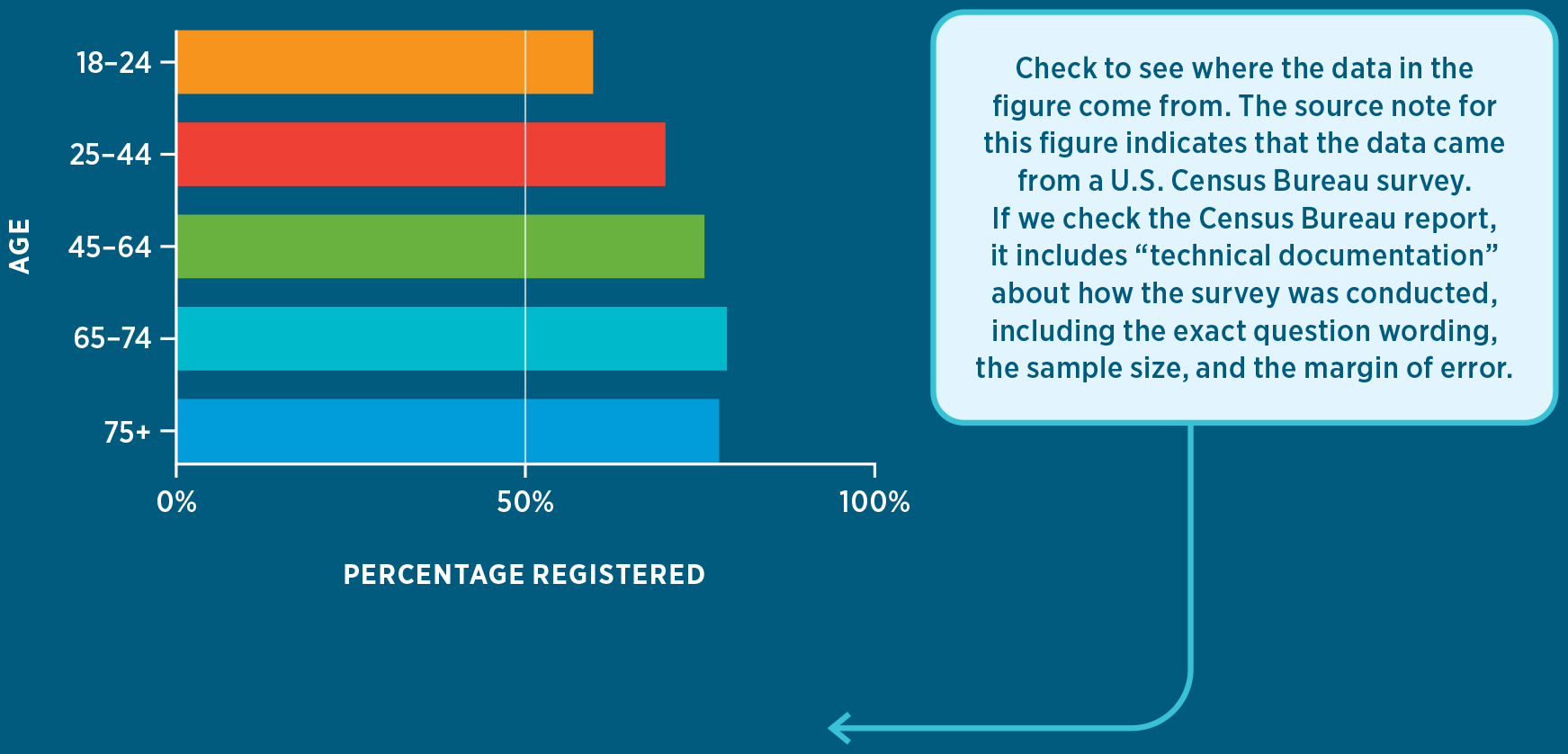
- What is the source of the data? Good graphs should have a note citing the source. In the United States, reliable sources include government agencies and mainstream news organizations, which generally gather data accurately and present them objectively, as in Figure G. Data from individuals or organizations that have specific agendas, such as interest groups, should be more carefully scrutinized.
- Is it clear what is being measured? For example, in a poll showing “Support for Candidate A,” do the results refer to the percentage of all Americans? The percentage of likely voters? The percentage of Democrats or Republicans? A good data figure should make this clear in the title, in the labels for the variables, and/or in a note.
- Do the variables capture the concepts we care about? There are many ways, for example, to measure whether a high school is successful (such as math scores, reading scores, graduation rate, or parent engagement). The decision about which variables to use depends on the specific question the researcher seeks to answer.
- Are survey questions worded appropriately? If the graph presents survey data, do the questions and the answer options seem likely to distort the results? Small changes in the wording of a survey question can drastically alter the results.
- Are the data based on a carefully selected sample? Some data sets include all individuals in a population; for example, the results of an election include the choices of all voters. Other data sets use a sample: a small group selected by researchers to represent an entire population. Most high-quality data sources will include information about how the data were collected, including the margin of error based on the sample size. (“Measuring Public Opinion” in Chapter 10 provides more information on sampling and other factors that affect the reliability of polls.)
figure G Voter Registration Rates by Age, 2020

SOURCE: U.S. Census Bureau, “Voting and Registration in the Election of November 2020,” Table 2, All Races, https://www.census.gov/data/tables/time-series/demo/voting-and-registration/p20-585.html (accessed 10/20/21).
SOURCES FOR OTHER FIGURES IN THIS SECTION:
Figure AGallup, https://news.gallup.com/poll/15370/party-affiliation.aspx (accessed 10/20/21).
Table APew Research Center, “Economy and COVID-19 Top the Public’s Policy Agenda for 2021,” January 28, 2021, https://www.pewresearch.org/politics/2021/01/28/economy-and-covid-19-top-the-publics-policy-agenda-for-2021/ (accessed 10/20/21).
Figures B, CU.S. Census Bureau (via Federal Reserve Bank of St. Louis), https://fred.stlouisfed.org/series/MEHOINUSA672N (accessed 10/20/21).
Figure DPew Research Center, “Important Issues in the 2020 Election,” August 30, 2020, https://www.pewresearch.org/politics/2020/08/13/important-issues-in-the-2020-election/ (accessed 10/20/21).
Figure ENBC News, “Highlights and Analysis from Election Day 2020,” January 6, 2021, https://www.nbcnews.com/politics/2020-election/live-blog/election-day-2020-live-updates-n1245892/ncrd1246088#blogHeader (accessed 10/20/21).
Figure FSpurious Correlations, https://www.tylervigen.com/spurious-correlations (accessed 10/20/21).