
More information
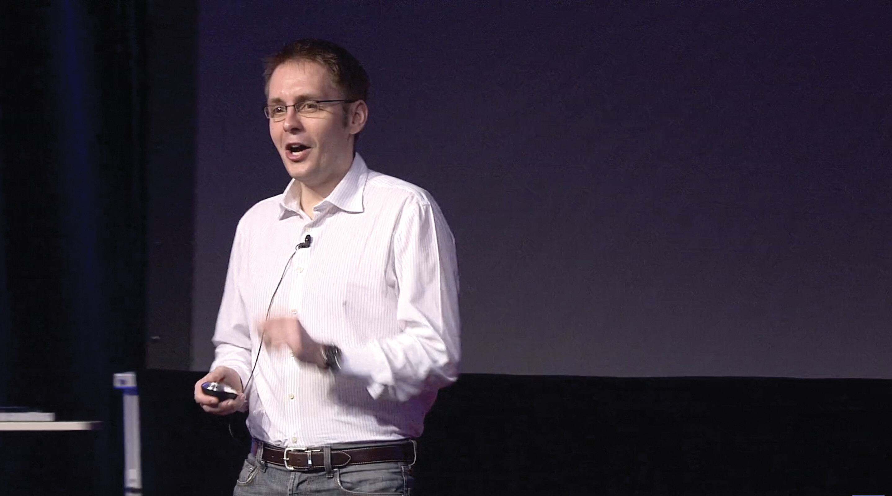
A close-up portrait of Sebastian Wernicke. He has short brown hair, glasses, and is smiling.
NOTABLE SPEAKER Sebastian Wernicke
Dr. Sebastian Wernicke clearly loves data—so much so that he is the Chief Data Scientist at One Logic, a company that helps organizations use data in meaningful ways. His TED talks are infused with a bit of humor, which may explain why his talk “Lies, Damned Lies and Statistics (about TEDTalks)” has been viewed more than two million times. He delivered the talk at the 2010 TEDActive program, which features workshops in a more casual and creative setting. Wernicke’s presentation is a skillful explanation of how to use data to design the ultimate TED talk—and is also a helpful example of how to organize content for a presentation.
Search Terms
To locate a video of this presentation online, enter the following key words into a search engine: Sebastian Wernicke Lies, Damned Lies and Statistics. The video is approximately 5:42 in length.
What to Watch For
More information
A screenshot of Sebastian Wernicke’s TED talk called Lies, Damned Lies and Statistics. He is standing on a stage holding a remote control and wearing a microphone.
[0:00–0:51] Using a conversational style, Wernicke draws his audience in with a bit of humor about, of all things, statistics. Within just a few seconds of beginning, he states the purpose of the presentation—his goal—quite clearly: to teach his audience how to design the ultimate TED talk. He reinforces this goal by making it visual and adding a humorous secondary purpose statement—“the worst possible TED talk that they would still let you get away with.” Using the rule of three, he describes specifically what he intends to say in his presentation (his central idea): what topic you should choose, how you should deliver the topic, and the visuals you should use on stage. Once again, he reinforces his point by making it visual.
More information
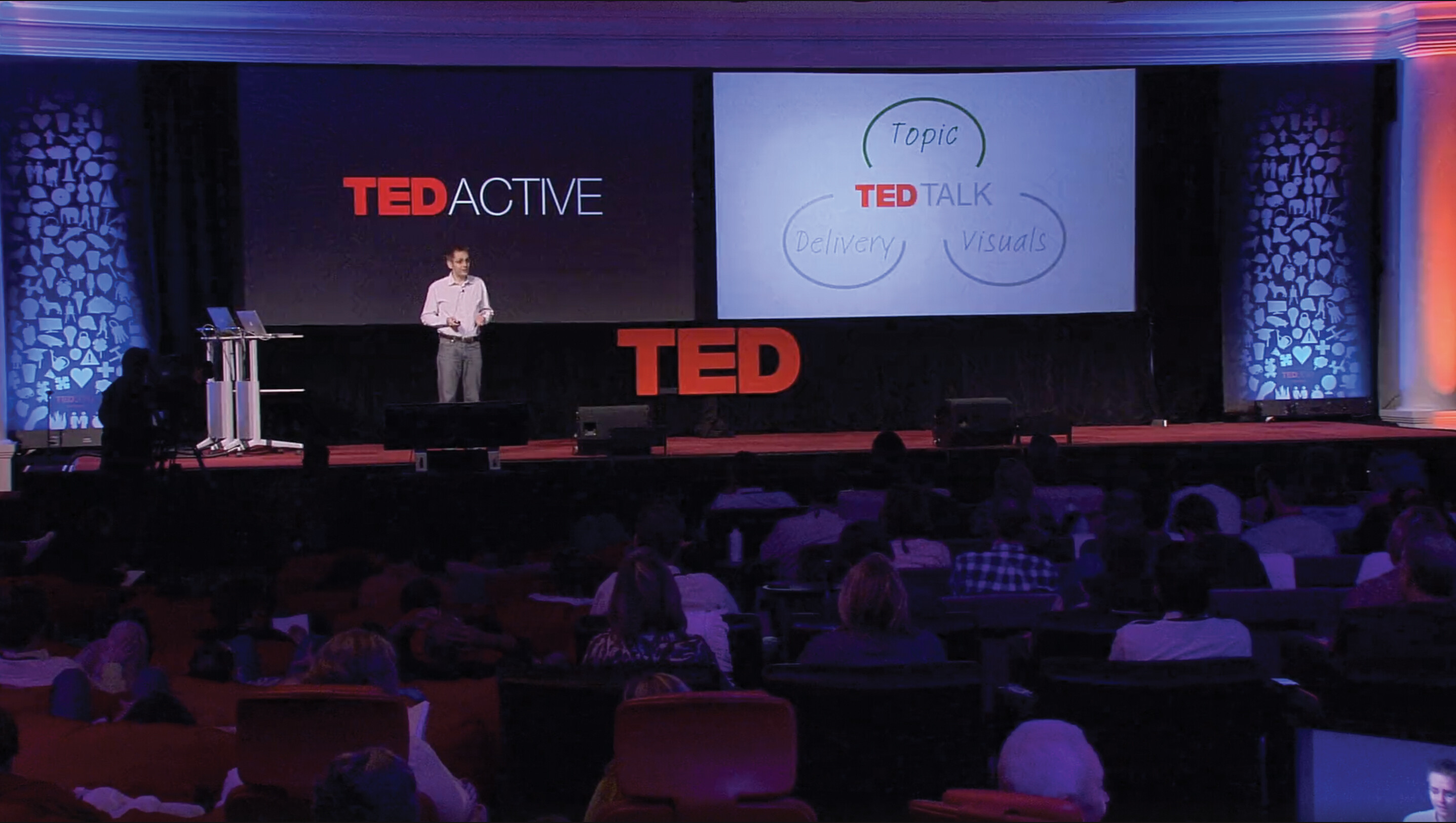
A screenshot of Sebastian Wernicke’s presentation called Lies, Damned Lies and Statistics. He is standing on a stage in front of a large crowd. Behind him one screen reads TED Active and a second screen reads TED talk with circles surrounding it labeled Topic, Delivery, and Visuals.
[0:52–1:52] Wernicke has chosen a categorical arrangement, taking the larger topic of how to create the ultimate TED talk and dividing it into three smaller categories: topic, delivery, and visuals. He uses several connectives, such as a transition to move the audience into the first of those categories: “Now, with the topic. . . .” He then provides another connective—the internal summary—to reinforce which topics TED audiences connect with more and which topics they connect with less.
More information
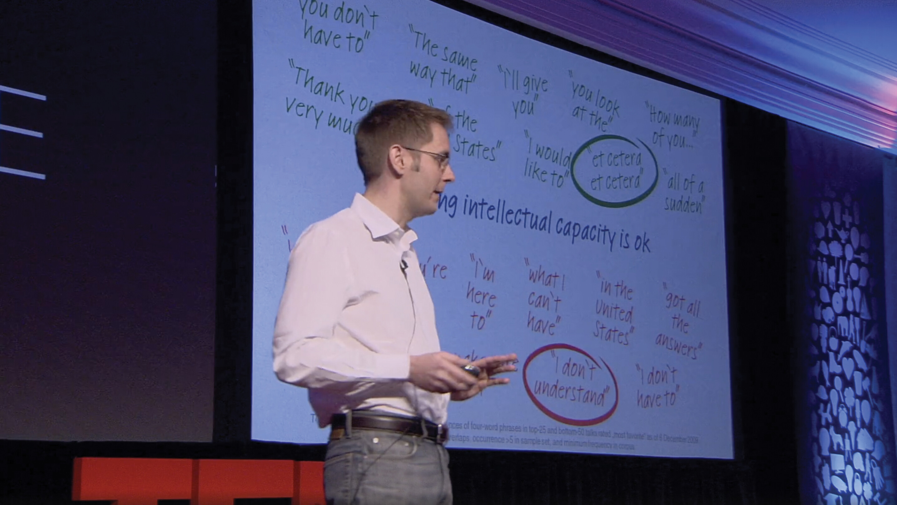
A screenshot of Sebastian Wernicke’s presentation called Lies, Damned Lies and Statistics. He is standing on a stage holding a remote control and wearing a microphone. Behind him is a slide is projected that says 3. It’s ok to fake intellectual capacity. There are several phrases written in green above this line, and several written in red below this line. Et cetera, et cetera is written in green and circled. I don’t understand is written in red and circled.
[1:53–3:16] Wernicke signals to his audience that he is transitioning to his next key point by asking a question: “How should you deliver your talk?” Using an internal preview, he tells his audience that he is going to give them three rules to obey when it comes to presenting their TED talk, and he clearly provides a signpost before talking about each one: “first of all,” “secondly,” and “finally.”
More information
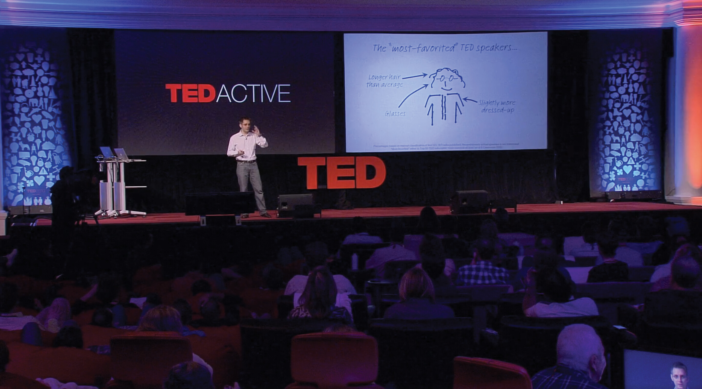
A screenshot of Sebastian Wernicke’s presentation called Lies, Damned Lies and Statistics. He is standing on a stage in front of a large crowd. Behind him one screen reads TED Active and a second screen has a slide projected onto it. The slide is titled The most-favorited TED speakers and features a crude drawing of a person. Arrows point to aspects of the person drawn to note that they have longer than average hair, glasses, and are slightly dressed-up.
[3:17–4:17] By saying, “Now, let’s go to the visuals,” he signals that he is moving onto his third key point. He continues to use bridge words and phrases to alert his audience that he is introducing a new supporting point. For example, the audience knows he is about to make a new point when he says, “And now the most important thing . . .”
More information
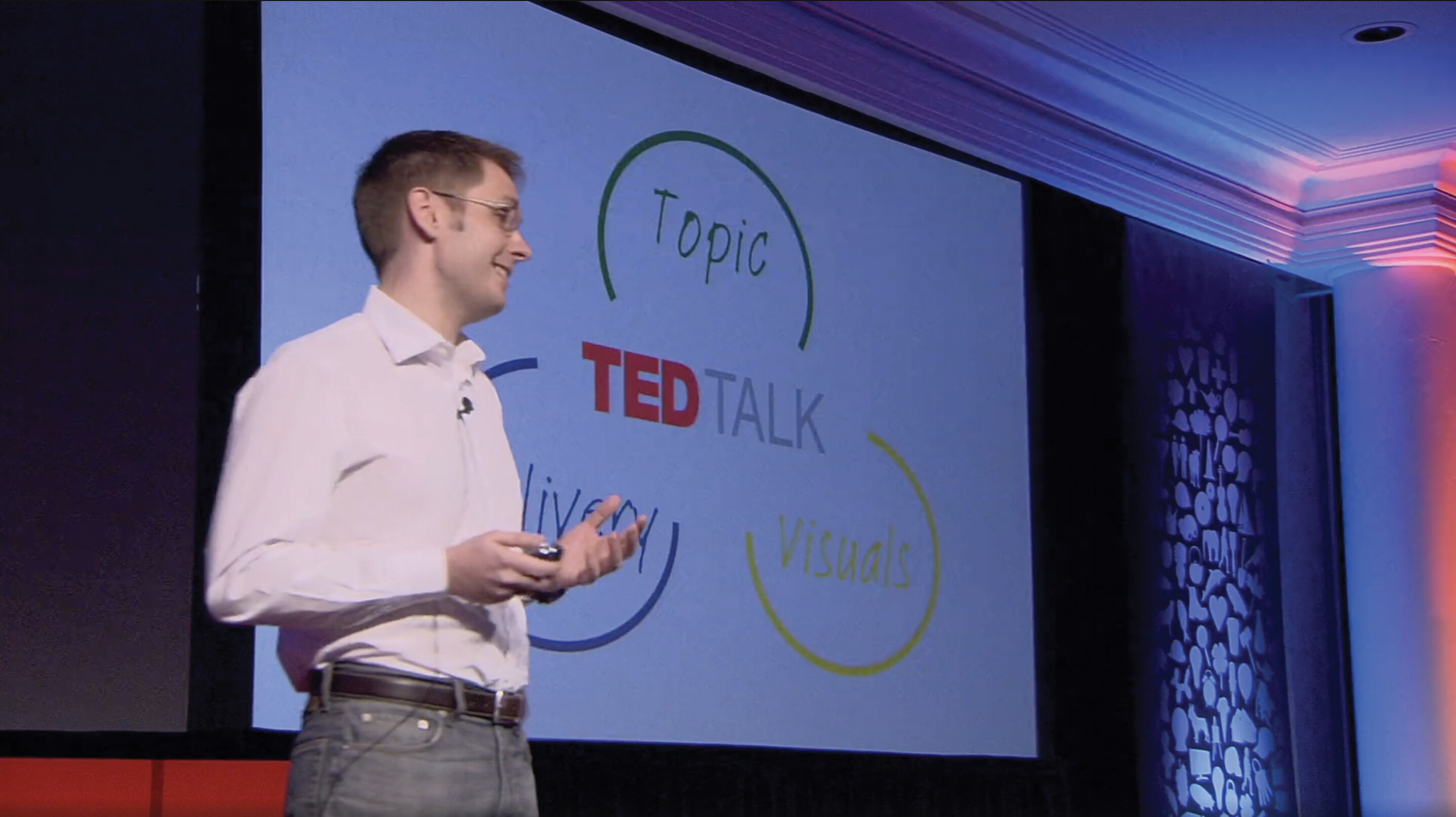
A screenshot of Sebastian Wernicke’s TED talk called Lies, Damned Lies and Statistics. He is standing on a stage holding a remote control and wearing a microphone. Behind him a screen reads TED talk and has circles surrounding it labeled Topic, Delivery, and Visuals.
[4:18–5:23] Wernicke makes it clear that he is concluding his presentation: “Now it’s time to put it all together.” He flashes back to the purpose statement, which is to help them design the ultimate TED talk. He calls for action by introducing them to TEDPad, a tool he created to help people create TED talks based on his statistical analysis of TED talk data. While this is a humorous call to action, it reinforces his use of statistics to help him accomplish his stated purpose.
While the slide with the three key points was displayed as he began the summary, there is an opportunity here for him to strengthen the conclusion by saying his central idea along with showing the visual. Before encouraging the audience to enjoy designing their own ultimate and worst possible TED talks, he could verbally remind them of his central idea: choosing the right topic, knowing how to deliver the topic, and using the right visuals on stage.
EXERCISE
After reviewing Wernicke’s speech, reflect on these questions:
- To what extent and how did Wernicke use any delivery transitions?
- Is there another pattern of organization that would have worked well for his presentation? Explain why or why not.
- Describe the effectiveness of his central idea. Could he have done anything differently to make it more effective?
- Which key point used connectives most effectively? Which one could have used them more effectively?
- Did you find it easy to remember Wernicke’s key points after his presentation? Why or why not?