Psychologists, being human, like to brag. They do this when they describe how well their assessment devices can predict behavior, and also when they talk about the strength of other research findings. Often—probably too often—they use words such as “large,” “important,” or even “dramatic.” Nearly always, they describe their results as “significant.” These descriptions can be confusing because there are no rules about how the first three terms can be employed. “Large,” “important,” and even “dramatic” are just adjectives and can be used at will. However, there are formal and rather strict rules about how the term significant can be employed.
Significance Testing
A significant result, in research parlance, is not necessarily large or important, let alone dramatic. But it is a result that would be unlikely to appear if everything were due only to chance. This is important, because in any experimental study the difference between two conditions will almost never13 turn out to be exactly zero, and in correlational studies an r of precisely zero is equally rare. So, how large does the difference between the means of two conditions have to be, or how big does the correlation coefficient need to be, before we will conclude that these are numbers we should take seriously?
The most commonly used method for answering this question is null-hypothesis significance testing (NHST). NHST attempts to answer the question, “What are the chances I would have found this result if nothing were really going on?” The basic procedure is taught in every beginning statistics class. A difference between experimental conditions (in an experimental study) or a correlation coefficient (in a correlational study) that is calculated to be significant at the 5 percent level is different from zero to a degree that, by chance alone, would be expected about 5 percent of the time. A difference or correlation significant at the 1 percent level is different from zero to a degree expected by chance about 1 percent of the time, and so this is traditionally considered a stronger result. Various statistical formulas, some quite complex, are employed to calculate the likelihood that experimental or correlational results would be expected by chance.14 The more unlikely, the better.
For example, look back at the results in Figures 2.4 and 2.5. These findings might be evaluated by calculating the p-level (probability level) of the difference in means (in the experimental study in Figure 2.4) or of the correlation coefficient (in the correlational study in Figure 2.5). In each case, the p-level is the probability that a difference of that size (or larger) would be found, if the actual size of the difference were zero. (This possibility of a zero result is called the null hypothesis.) If the result is significant, the common interpretation is that the statistic probably did not arise by chance; its real value, sometimes called the population value, is probably not zero, so the null hypothesis is incorrect, and the result is big enough to take seriously.
This traditional method of statistical data analysis is deeply embedded in the scientific literature and current research practice, and is almost universally taught in beginning statistics classes. But I would not be doing my duty if I failed to warn you that insightful psychologists have been critical of this method for many years (e.g., Rozeboom, 1960), and the frequency and intensity of this criticism have only increased over time (e.g., Cumming, 2012, 2014; Dienes, 2011; Haig, 2005; G. R. Loftus, 1996). Indeed, some psychologists have suggested that conventional significance testing should be banned altogether (Hunter, 1997; F. L. Schmidt, 1996)! That may be going a bit far, but NHST does have some serious problems. This chapter is not the place for an extended discussion, but it might be worth a few words to describe some of the more obvious difficulties (see also Cumming, 2014; Dienes, 2011).
One problem with NHST is that its underlying logic is very difficult to describe precisely, and its interpretation—including the interpretation given in many textbooks—is frequently wrong. It is not correct, for example, that the significance level provides the probability that the research (non-null) hypothesis is true. A significance level of .05 is sometimes taken to mean that the probability that the research hypothesis is true is 95%! Nope. You wish. Instead, the significance level gives the probability of getting the result one found if the null hypothesis were true. One statistical writer offered the following analogy (Dienes, 2011): The probability that a person is dead, given that a shark has bitten his head off, is 1.0. However, the probability that a person’s head was bitten off by a shark, given that he is dead, is much lower. Most people die in less dramatic fashion. The probability of the data given the hypothesis, and of the hypothesis given the data, is not the same thing.15 And the latter is what we really want to know.
The probability of the data given the hypothesis, and of the hypothesis given the data, is not the same thing.
Believe it or not, I really did try to write the preceding paragraph as clearly as I could. But if you found it confusing, you are in good company. One study found that 97 percent of academic psychologists, and even 80 percent of methodology instructors, misunderstood NHST in an important way (Krauss & Wassner, 2002). The most widely used method for interpreting research findings is so confusing that even experts often get it wrong. This cannot be a good thing.
A more obvious difficulty with NHST is that the criterion for a significant result is little more than a traditional rule of thumb. Why is a result of p< .05 significant, when a result of p< .06 is not? There is no real answer, and nobody seems to even know where the standard .05 level came from in the first place (though I strongly suspect it has something to do with the fact that we have five fingers on each hand). In fact, an argument broke out recently when some psychologists proposed lowering the .05 threshold to the (seemingly) more stringent level of .005 (Benjamin et al., 2017). Others (including your textbook author) saw little value in replacing one arbitrary threshold with another (Funder, 2017).
Yet another common difficulty is that even experienced researchers too often misinterpret a nonsignificant result to mean “no result.” If, for example, the obtained p-level is .06, researchers sometimes conclude that there is no difference between the experimental and control conditions or no relationship between two correlated variables. But actually, the probability is only 6 out of 100 that, if there were no effect, a difference this big would have been found.
This observation leads to one final difficulty with traditional significance tests: The p-level addresses only the probability of one kind of error, conventionally called a Type I error. A Type I error involves deciding that one variable has an effect on, or a relationship with, another variable, when really it does not. But there is another kind: A Type II error involves deciding that one variable does not have an effect on, or relationship with, another variable, when it really does. Unfortunately, there is no way to estimate the probability of a Type II error without making extra assumptions (J. Cohen, 1994; Dienes, 2011; Gigerenzer, Hoffrage, & Kleinbolting, 1991).
What a mess. The bottom line is this: When you take a course in psychological statistics, if you haven’t done so already, you will have to learn about significance testing and how to do it. Despite its many and widely acknowledged flaws, NHST remains in wide use (S. Krauss & Wassner, 2002). But it is not as useful a technique as it looks at first, and psychological research practice seems to be moving slowly but surely away (Abelson, Cohen, & Rosenthal, 1996; Cumming, 2014; Wilkinson & The Task Force on Statistical Inference, 1999). The p-level at the heart of NHST is not completely useless; it can serve as a rough guide to the strength of one’s results (Krueger & Heck, 2018). However, in the future, evaluating research is likely to focus less on statistical significance, and more on considerations such as effect size and replication, the two topics to be considered next.
Effect Size
All scientific findings are not created equal. Some are bigger than others, which raises a question that must be asked about every result: How big is it? Is the effect or the relationship we have found strong enough to matter, or is its size too trivial to care about? Because this is an important question, psychologists who are better analysts of data do not just stop with significance. They move on to calculate a number that will reflect the magnitude, as opposed to the likelihood, of their result. This number is called an effect size (Grissom & Kim, 2012).
An effect size is more meaningful than a significance level. Don’t take my word for it; the principle is official: The Publication Manual of the American Psychological Association (which sets the standards that must be followed by almost all published research in psychology) explicitly says that the probability value associated with statistical significance does not reflect “the magnitude of an effect or the strength of a relationship. For the reader to fully understand the magnitude or importance of a study’s findings, it is almost always necessary to include some index of effect size” (American Psychological Association, 2010, p. 34).
Many measures of effect size have been developed, including standardized regression weights (beta coefficients), odds ratios, relative risk ratios, and a statistic called Cohen’s d (the difference in means divided by the standard deviation). The most commonly used and my personal favorite is the correlation coefficient. Despite the name, its use is not limited to correlational studies. As we saw in Chapter 2, the correlation coefficient can be used to describe the strength of either correlational or experimental results (Funder & Ozer, 1983).
CALCULATING CORRELATIONS To calculate a correlation coefficient, in the usual case, you start with two variables, and arrange all of the scores on the two variables into two columns, with each row containing the scores for one participant. These columns are labeled x and y. Traditionally, the variable you think is the cause is put in the x column and the variable you think is the effect is put in the y column. So, in the example considered in Chapter 2, x was “anxiety” and y was “performance.” Then you apply a common statistical formula (found in any statistics textbook) to these numbers or, more commonly, you punch the numbers into a computer or maybe even a handheld calculator.16
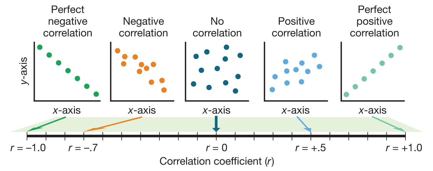
The result is a correlation coefficient (the most common is the Pearson r). This is a number that—if you did the calculations right—is somewhere between +1 and –1 (Figure 3.5). If two variables are unrelated, the correlation between them will be near zero. If the variables are positively associated—as one goes up, the other tends to go up too, like height and weight—then the correlation coefficient will be greater than zero (i.e., a positive number). If the variables are negatively associated—as one goes up, the other tends to go down, like “anxiety” and “performance”—then the correlation coefficient will be less than zero (i.e., a negative number). Essentially, if two variables are correlated (positively or negatively), this means that one of them can be predicted from the other. For example, back in Chapter 2, Figure 2.5 showed that if I know how anxious you are, then I can predict (to a degree) how well you will do on a math test.
Figure 3.5Correlation Coefficient The correlation coefficient is a number between –1.0 and 1.0 that indicates the relationship between two variables, traditionally labeled x and y.
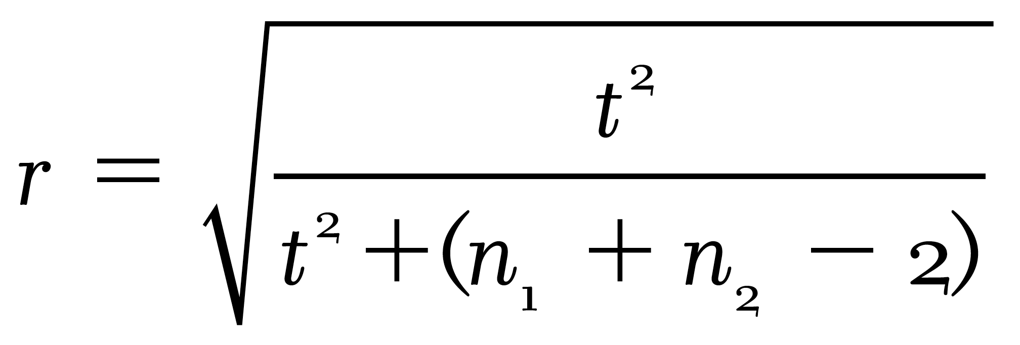
Not everybody knows this, but you can also get a correlation coefficient from experimental studies. For the experiment on test performance, for example, you could just give everybody in the high-anxiety condition a “1” for anxiety and everybody in the low-anxiety condition a “0.” These 1s and 0s would go in the x column, and participants’ corresponding levels of performance would go in the y column. There are also formulas to directly convert the statistics usually seen in experimental studies into correlations. For example, the t or F statistic (used in the analysis of variance) can be directly converted into an r.17 It is good practice to do this conversion whenever possible, because then you can compare the results of correlational and experimental studies using a common metric.
INTERPRETING CORRELATIONS To interpret a correlation coefficient, it is not enough just to assess its statistical significance. An obtained correlation becomes significant in a statistical sense merely by being unlikely to have arisen if the true correlation is zero, which depends almost as much on how many participants you managed (or could afford) to recruit as on how strong the effect really is. Instead, you need to look at the correlation’s actual size. Some textbooks provide rules of thumb. One I happen to own says that a correlation (positive or negative) of .6 to .8 is “quite strong,” one from .3 to .5 is “weaker but still important,” and one from .3 to .2 is “rather weak.” I have no idea what these phrases are supposed to mean. Do you?
Another commonly taught way to evaluate correlations is to square them18, which tells “what percent of the variance the correlation explains.” This certainly sounds like what you need to know, and the calculation is wonderfully easy. For example, a correlation of .30, when squared, yields .09, which means that “only” 9 percent of the variance is explained by the correlation, and the remaining 91 percent is “unexplained.” Similarly, a correlation of .40 means that “only” 16 percent of the variance is explained and 84 percent is unexplained. That seems like a lot of unexplaining, and so such correlations are often viewed as small.
Despite the wide popularity of this squaring method (if you have taken a statistics course you were probably taught it), I think it is a terrible way to evaluate effect size. The real and perhaps only result of this pseudo-sophisticated maneuver is, misleadingly, to make the correlations typically found in psychological research seem trivial. It is the case that in both correlational research in personality and experimental research in social psychology, the effect sizes expressed in correlations rarely exceed .40. If results like these are considered to “explain” (whatever that means) “16 percent of the variance” (whatever that means), leaving “84 percent unexplained,” then we are left with the vague but disturbing conclusion that research has not accomplished much. Yet, this conclusion is not correct (Ozer, 1985).19 Worse, it is almost impossible to understand. What is really needed is a way to evaluate the size of correlations to help understand the strength and, in some cases, the usefulness of the result obtained.
THE BINOMIAL EFFECT SIZE DISPLAY Rosenthal and Rubin (1982) provided a brilliant technique for demonstrating the size of effect-size correlations. Their method is called the Binomial Effect Size Display (BESD). Let’s use their favorite example to illustrate how it works.
Assume you are studying 200 participants, all of whom are sick. An experimental drug is given to 100 of them; the other 100 are given nothing. At the end of the study, 100 are alive and 100 are dead. The question is, how much difference did the drug make? Were the 100 people who got the drug more likely to be among the 100 who lived?
Sometimes the answer to this question is reported in the form of a correlation coefficient. For example, you may be told that the correlation between taking the drug and recovering from the illness is .40. If the report stops here (as it often does), you are left with the following questions: What does this mean? Was the effect big or little? If you were to follow the common practice of squaring correlations to yield “variance explained,” you might conclude that “84 percent of the variance remains unexplained” (which sounds pretty bad) and decide the drug is nearly worthless.
The BESD provides another way to look at things. Through some simple further calculations, you can move from a report that “the correlation is .40” to a concrete display of what that correlation means in terms of specific outcomes. As shown in Table 3.1, a correlation of .40 means that 70 percent of those who got the drug are still alive, whereas only 30 percent of those who did not get the drug are still alive. If the correlation is .30, those figures would be 65 percent and 35 percent, respectively. As Rosenthal and Rubin pointed out, these effects might technically only explain 16 percent or even 9 percent of the variance, but in either case, if you got sick, would you want this drug?
Table 3.1THE BINOMIAL EFFECT SIZE DISPLAY
Alive
Dead
Total
Drug
70
30
100
No Drug
30
70
100
Total
100
100
200
Life and death outcomes for participants in a hypothetical 200-person drug trial, when the correlation between drug administration and outcome r= .40.
Source: Adapted from Rosenthal & Rubin (1982), p. 167.
The computational method begins by assuming a correlation of zero, which gives each of the four cells in the table an entry of 50 (i.e., if there is no effect, then 50 participants receiving the drug will live and 50 will die—it does not matter whether they get the treatment or not). Then we take the actual correlation (in the example, .40), remove the decimal to produce a two-digit number (.40 becomes 40), divide by 2 (in this case yielding 20), and add it to the 50 in the upper-left-hand cell (yielding 70). Then we adjust the other three cells by subtraction. Because each row and column must total 100, the four cells, reading clockwise, become 70, 30, 70, and 30.
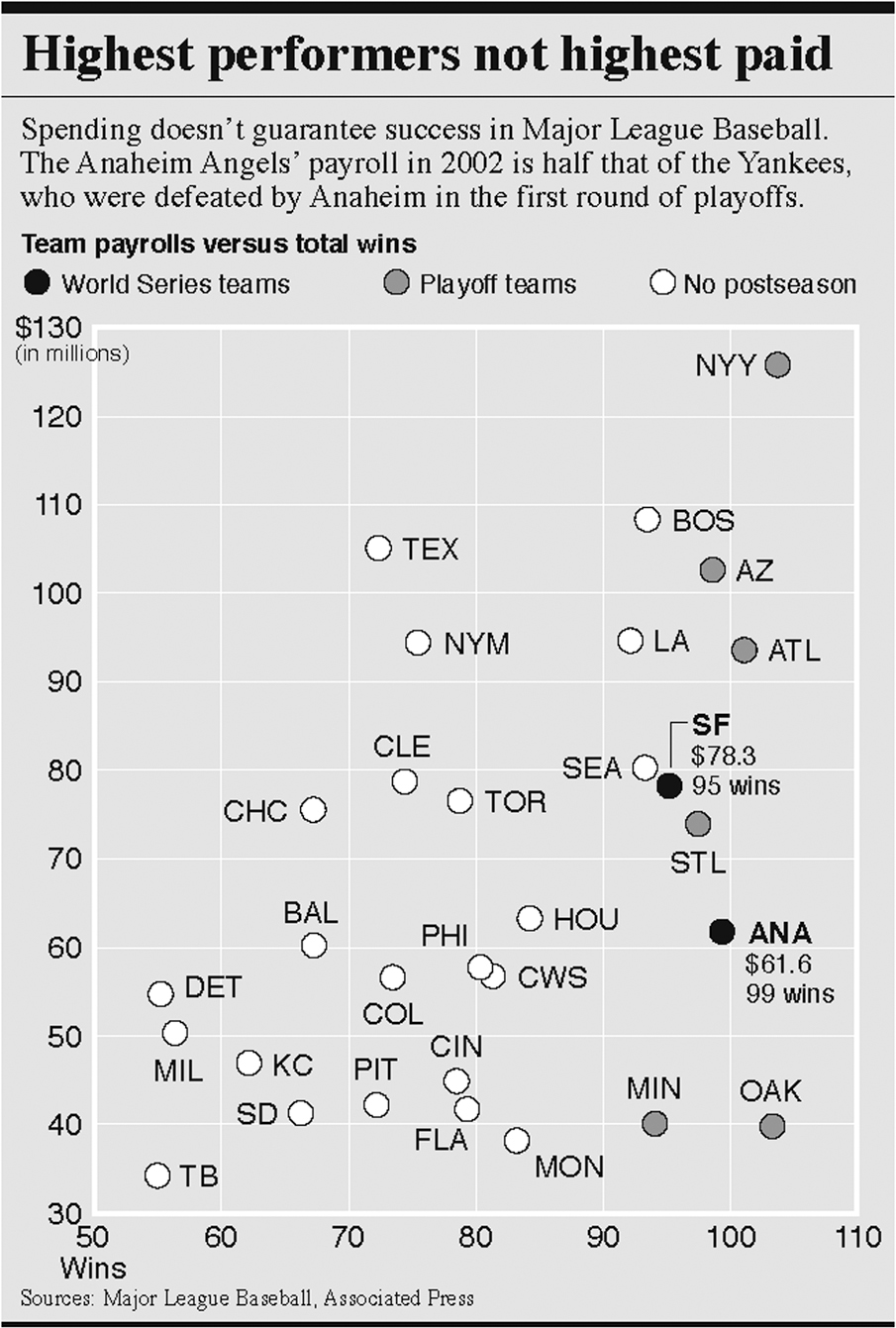
This technique works with any kind of data. “Alive” and “dead” can be replaced with any kind of dichotomized outcomes—“better-than-average school success” and “worse-than-average school success,” for example. The treatment variables could become “taught with new method” and “taught with old method.” Or the variables could be “scores above average on school motivation” and “scores below average on school motivation,” or any other personality variable (see Table 3.2). One can even look at predictors of success for Major League Baseball teams (see Figure 3.6).
Table 3.2THE BINOMIAL EFFECT SIZE DISPLAY USED TO INTERPRET (HYPOTHETICAL) SCHOOL DATA
School Performance
School Motivation
Above Average
Below Average
Total
Above average
50
50
100
Below average
50
50
100
Total
100
100
200
School performance outcomes for 200 students above and below average on school motivation when correlation between the two variables r= 0.
School Performance
School Motivation
Above Average
Below Average
Total
Above average
65
35
100
Below average
35
65
100
Total
100
100
200
School performance outcomes for 200 students above and below average on school motivation when correlation between the two variables r= .30.
Figure 3.6Statistics on the Sports Page An analysis of the relationship between total payrolls of Major League Baseball teams and number of games won during the 2002 season. This chart appeared in the sports section of the Los Angeles Times. Notice the conclusion expressed by the headline. Is it valid? The correlation between payroll and games won is .44, which, according to the Binomial Effect Size Display, means that a team that pays above-average salaries has a 72% chance of winning more than half its games, whereas a team that pays below-average salaries has only a 28% chance.
The BESD shows vividly both how much of an effect an experimental intervention is likely to have, and how well one can predict an outcome from an individual measurement of difference. So, when you read—later in this book or in a psychological research article—that one variable is related to another with a correlation of .30 or .40 or whatever, you should construct a BESD in your mind and evaluate the size of the correlation accordingly.
Replication
Beyond the size of a research result, no matter how it is evaluated, lies a second and even more fundamental question: Is the result dependable, something you could expect to find again and again, or did it merely occur by chance? As was discussed above, null hypothesis significance testing (NHST) is typically used to answer this question, but it is not really up to the job. A much better indication of the stability of results is replication. In other words, do the study again. Statistical significance is all well and good, but there is nothing quite so persuasive as finding the same result repeatedly, with different participants and in different labs (Asendorpf et al., 2013; Funder et al., 2014).20
The principle of replication seems straightforward, but it has led to a remarkable degree of controversy in recent years—not just within psychology, but in many areas of science. One early spark for the controversy was an article, written by a prominent medical researcher and statistician, entitled “Why most published research findings are false” (Ionnadis, 2005). That title certainly got people’s attention! The article focused on biomedicine but addressed reasons why findings in many areas of research shouldn’t be completely trusted. These include the proliferation of small studies with weak effects, researchers reporting only selected analyses rather than everything they find, and the undeniable fact that researchers are rewarded, with grants and jobs, for studies that get interesting results. Another factor is publication bias, the fact that studies with strong results are more likely to be published than studies with weak results—leading to a published literature that makes effects seem stronger than they really are (Polanin, Tanner-Smith, & Hennessy, 2016).
Worries about the truth of published findings spread to psychology a few years later, in a big way, when three things happened almost at once. First, an article in the influential journal Psychological Science outlined how researchers could make almost any data set yield significant findings through techniques such as deleting unusual responses, adjusting results to remove the influence of seemingly extraneous factors, and neglecting to report experimental conditions or even whole experiments that fail to get expected results (Simmons, Nelson, & Simonsohn, 2011). Such questionable research practices (QRP’s) have also become known as p-hacking, a term which refers to hacking around in one’s data until one finds the necessary degree of statistical significance, or p-level, that allows one’s findings to be published. To demonstrate how this could work, Simmons and his team massaged a real data set to “prove” that listening to the Beatles song “When I’m 64” actually made participants younger!
Coincidentally, at almost exactly the same time, the prominent psychologist Daryl Bem published an article in a major journal purporting to demonstrate a form of ESP called “precognition,” reacting to stimuli that are presented in the future (Bem, 2011). And then, close on the heels of that stunning event, another well-known psychologist, Diederik Stapel, was exposed for having become famous on the basis of studies in which he, quite literally, faked his data (Bhattacharjee, 2013). The two cases of Bem and Stapel were different because nobody suggested that Bem committed fraud, but nobody seemed to be able to repeat his findings, either, suggesting that flawed (but common) practices of data analysis were to blame (Wagenmakers, Wetzels, Borsboom, & van der Maas, 2011). For example, it was suggested that Bem might have published only the studies that successfully demonstrated precognition, not the ones that failed. One thing the two cases did have in common was that the work of both researchers had passed through the filters of scientific review that were supposed to ensure that published findings can be trusted.
And this was just the beginning. Before too long, many seemingly well-established findings in psychology were called into question when researchers found that they were unable to repeat them in their own laboratories (Open Science Collaboration, 2015). One example is a study that I described in previous editions of this very book, a study that purported to demonstrate a phenomenon sometimes called “elderly priming” (Anderson, 2015; Bargh, Chen, & Burrows, 1996). College student participants were “primed” with thoughts about old people by having them unscramble words such as “DNIRKWE” (wrinkled), “LDO” (old), and (my favorite) “FALODRI” (Florida). Others were given scrambles of neutral words such as “thirsty,” “clean,” and “private.” The remarkable—even forehead-slapping—finding was that when they walked away from the experiment, participants in the first group moved more slowly down the hallway than participants in the second group! Just being subtly reminded about concepts related to being old, it seemed, is enough to make a person act old.
I reported this fun finding in previous editions because the measurement of walking speed seemed like a great example of B-data, as described in Chapter 2, and also because I thought readers would enjoy learning about it. That was my mistake! The original study was based on just a few participants21 and later attempts to repeat the finding, some of which used much larger samples, were unable to do so (e.g., Anderson, 2015; Doyen, Klein, Pichon, & Cleeremans, 2012; Pashler, Harris & Coburn, 2011). In retrospect, I should have known better. Not only were the original studies very small, but the finding itself is so remarkable that extra-strong evidence should have been required before I believed it.22
Scientific conclusions are the best interpretations that can be made based on the evidence at hand. But they are always subject to change.
The questionable validity of this finding and many others that researchers tried and failed to replicate stimulated lively and sometimes acrimonious exchanges in forums ranging from academic symposia and journal articles to impassioned tweets, blogs, and Facebook posts. At one (low) point, a prominent researcher complained that colleagues attempting to evaluate replicability were no more than “shameless little bullies.” But for the most part, cooler heads prevailed, and insults gave way to positive recommendations for how to make research more dependable in the future (Funder et al., 2014; Shrout & Rodgers, 2018). These recommendations include using larger numbers of participants than has been traditional, disclosing all methods, sharing data, and reporting studies that don’t work as well as just those that do. The most important recommendation—and one that really should have been followed all along—is to never regard any one study as conclusive proof of anything, no matter who did the study, where it was published, or what its p-level was (Donnellan & Lucas, 2018). The key attitude of science is—or should be—that all knowledge is provisional. Scientific conclusions are the best interpretations that can be made based on the evidence at hand. But they are always subject to change.
A number between –1 and +1 that reflects the degree to which one variable, traditionally called y, is a linear function of another, traditionally called x. A negative correlation means that as x goes up, y goes down; a positive correlation means that as x goes up, so does y; a zero correlation means that x and y are unrelated.
A method for displaying and understanding more clearly the magnitude of an effect reported as a correlation, by translating the value of r into a 2 × 2 table comparing predicted with obtained results.
Doing a study again to see if the results hold up. Replications are especially persuasive when done by different researchers in different labs than the original study.
Research practices that, while not exactly deceptive, can increase the chances of obtaining the result the researcher desires. Such practices including deleting unusual responses, adjusting results to remove the influence of seemingly extraneous factors, and neglecting to report variables or experimental conditions that fail to yield expected results. Such practices are not always wrong, but they should always be questioned.
14. Another way to determine the chance probability of one’s results is with a randomization test, which assesses how often the results appear when the data are randomly rearranged (Sherman & Funder, 2009). Because randomization tests do not require the many assumptions required by conventional statistical analyses and are becoming ever more feasible with modern computers, they seem likely to become more widely used in the future.
15. However, all other things being equal, they are correlated (Krueger & Heck, 2018).
16. Programs to calculate the correlation coefficient are also available online. One easy-to-use calculator can be found at https://www.socscistatistics.com/tests/pearson/.
17. The most commonly used statistic that reflects a difference between two experimental groups is the t (the outcome of a t-test). The standard symbol for the commonly used Pearson correlation coefficient is r, and n1 and n2 refer to the number of participants in the two experimental groups. The experimental t can be converted to the correlational r using the following formula:
where n1 and n2 are the sizes of the two samples (or experimental groups) being compared.
18. The reason for doing this has to do with converting variation, which is deviation from the mean, with variance, which is squared deviation from the mean.
19. I have found that many of my colleagues, with PhD’s in psychology themselves, resist accepting this fact, because of what they were taught in their first statistics course long ago. All I can do in such cases is urge that they read the Ozer (1985) paper just referenced. To encapsulate the technical argument, “variance” is the sum of squared deviations from the mean; the squaring is a computational convenience but has no other meaning or rationale. However, one consequence is that the variance explained by a correlation is in squared units, not the original units that were measured. To get back to the original units, just leave the correlation unsquared. Then, a correlation of .40 can be seen to explain 40% of the (unsquared) variation, as well as 16% of the (squared) variance.
20. R. A. Fisher, usually credited as the inventor of NHST, wrote “we may say that a phenomenon is experimentally demonstrable when we know how to conduct an experiment that will rarely fail to give us a statistically significant result” (1966, p 14).
21. Actually, there were two studies, each with 30 participants, which is a very small number by any standard.
22. The astronomer Carl Sagan popularized the phrase “extraordinary claims require extraordinary evidence,” but he wasn’t the first to realize the general idea. David Hume wrote in 1748 that “No testimony is sufficient to establish a miracle, unless the testimony be of such a kind, that its falsehood would be more miraculous than the fact which it endeavors to establish” (Rational Wiki, 2018).