Use  to help you study and master this material.
CONCLUSION: PREPARING TO ANALYZE THE AMERICAN POLITICAL SYSTEM
This introductory chapter has set the stage for an analytical treatment of the phenomena that constitute American politics. This analytical approach requires attention to argument and evidence. To construct an argument about some facet of American politics—Why do incumbent legislators in the House and Senate have so much success in securing reelection? Why does the president dominate media attention?—we can draw on a set of five principles. The linchpin is the rationality principle, which emphasizes individual goal seeking as a key explanation for behavioral patterns. But politics is a collective undertaking, and it is often structured by political arrangements, so we also focus on collective action and the institutions in which such action occurs through the lens of the collective action principle and the institution principle. The combination of goal-seeking individuals engaging in collective activity in institutional contexts provides leverage for understanding why governments govern as they do—making laws, passing budgets, implementing policies, rendering judicial judgments—that is, the policy principle. But we could not make entire sense of these activities without an appreciation of the broader historical path: the history principle. These five principles, then, are tools of analysis. They are also tools of discovery, permitting the interested observer to uncover new ideas about why politics works as it does.
To know if an argument truly contributes to our understanding of the real world, we need to look at evidence. In the study of American politics, much of this evidence takes the form of quantitative data, and much of it is accessible online. Making sense of such evidence is what political scientists do. In Analyzing the Evidence on pp. 26–31, we provide a brief glimpse of how to go about this task. We hope it helps you think analytically about political information as we move through the rest of the book.
Drawing on the lesson of the history principle, we will begin in the remaining chapters of Part 1 by setting the historical stage. Then, with analytical principles and strategies in hand, we can understand what influenced and inspired the founding generation to create a national government and a federal political system, while preserving individual rights and liberties.
For Further Reading
★ = included in Readings in American Politics, 6e
Bianco, William T. American Politics: Strategy and Choice. New York: Norton, 2001.
Crawford, Sue E. S., and Elinor Ostrom. “A Grammar of Institutions.” American Political Science Review 89, no. 3 (1995): 582–600.
★ Dahl, Robert A. Polyarchy: Participation and Opposition. New Haven, CT: Yale University Press, 1971.
Downs, Anthony. An Economic Theory of Democracy. New York: Harper and Row, 1957.
Ellickson, Robert C. Order without Law: How Neighbors Settle Disputes. Cambridge, MA: Harvard University Press, 1991.
Gailmard, Sean, and John W. Patty. Learning While Governing: Expertise and Accountability in the Executive Branch. Chicago: University of Chicago Press, 2013.
Hardin, Garrett. “The Tragedy of the Commons.” Science 162, no. 3859 (1968): 1243–48.
Kiewiet, D. Roderick, and Mathew D. McCubbins. The Logic of Delegation: Congressional Parties and the Appropriations Process. Chicago: University of Chicago Press, 1991.
★ Mansbridge, Jane. “What Is Political Science For?” Perspectives on Politics 12, no. 1 (2014): 8–17.
Mayhew, David R. Congress: The Electoral Connection. New Haven, CT: Yale University Press, 1974.
★ Olson, Mancur, Jr. The Logic of Collective Action: Public Goods and the Theory of Groups. 1965. Second printing with a new preface and appendix. Cambridge, MA: Harvard University Press, 1971.
Shepsle, Kenneth A. Analyzing Politics: Rationality, Behavior, and Institutions. 2nd ed. New York: Norton, 2010.
analyzing the evidence
Making Sense of Charts and Graphs
Contributed by Jennifer Bachner, Johns Hopkins University
Throughout this book, you will encounter graphs and charts that show some of the quantitative data that political scientists use to study government and politics. This section provides three general steps to help you interpret and evaluate common ways data are presented—both in this text and beyond.
Step 1: Identify the Purpose of the Graph or Chart
When you come across a graph or chart, your first step should be to identify its purpose. The title will usually indicate whether the purpose of the graph or chart is to describe one or more variables or to show a relationship between variables. Note that a variable is a set of possible values. The variable “years of education completed,” for example, can take on values such as “8,” “12,” or “16.”
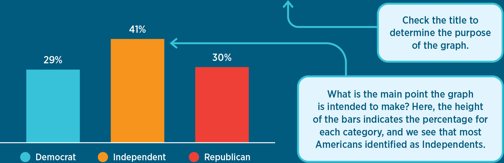
 Descriptive Graphs and Charts.The title of the graph in Figure A, “Party Identification in the United States, 2024,” tells us that the graph focuses on one variable, party identification, rather than showing a relationship between two or more variables. It is therefore a descriptive graph.
figure A Party Identification in the United States, 2024
More information
A bar graph shows the percentage of Americans who identify as Democrat, Republican, or Independent in 2024. The graph shows that 29 percent identify as Democrat, 41 percent identify as independent, and 30 percent identify as Republican.
There are two additional boxes in the graphic that explain important data literacy concepts. The first points to the title of the graph and reads: Check the title to determine the purpose of the graph. The second points to the highest bar (Independents) and reads: What is the main point the graph is intended to make? Here, the height of the bars indicates the percentage for each category, and we see that most Americans identified as Independents.
If a graph is descriptive, you should identify the variable being described and think about the main point the author is trying to make about that variable. In Figure A, we see that party identification can take on one of three values (“Democrat,” “Independent,” or “Republican”) and that the author has plotted the percentage of survey respondents for each of these three values using vertical bars. The height of each bar indicates the percentage of people in each category, and comparing the bars to each other tells us that more Americans identified as Independents than either Republicans or Democrats in 2024. This is one main takeaway from the graph.
Graphs and Charts That Show a Relationship.Let’s turn to Table A, “Policy Priorities by Age Group.” Notice that there are two variables—policy priorities and age—mentioned in the title, which indicates that the chart will compare them. We know, therefore, that the chart will illustrate the relationship between these two variables rather than simply describe them.
table A Policy Priorities by Age Group
Percent who say that . . . should be a top priority for the government*
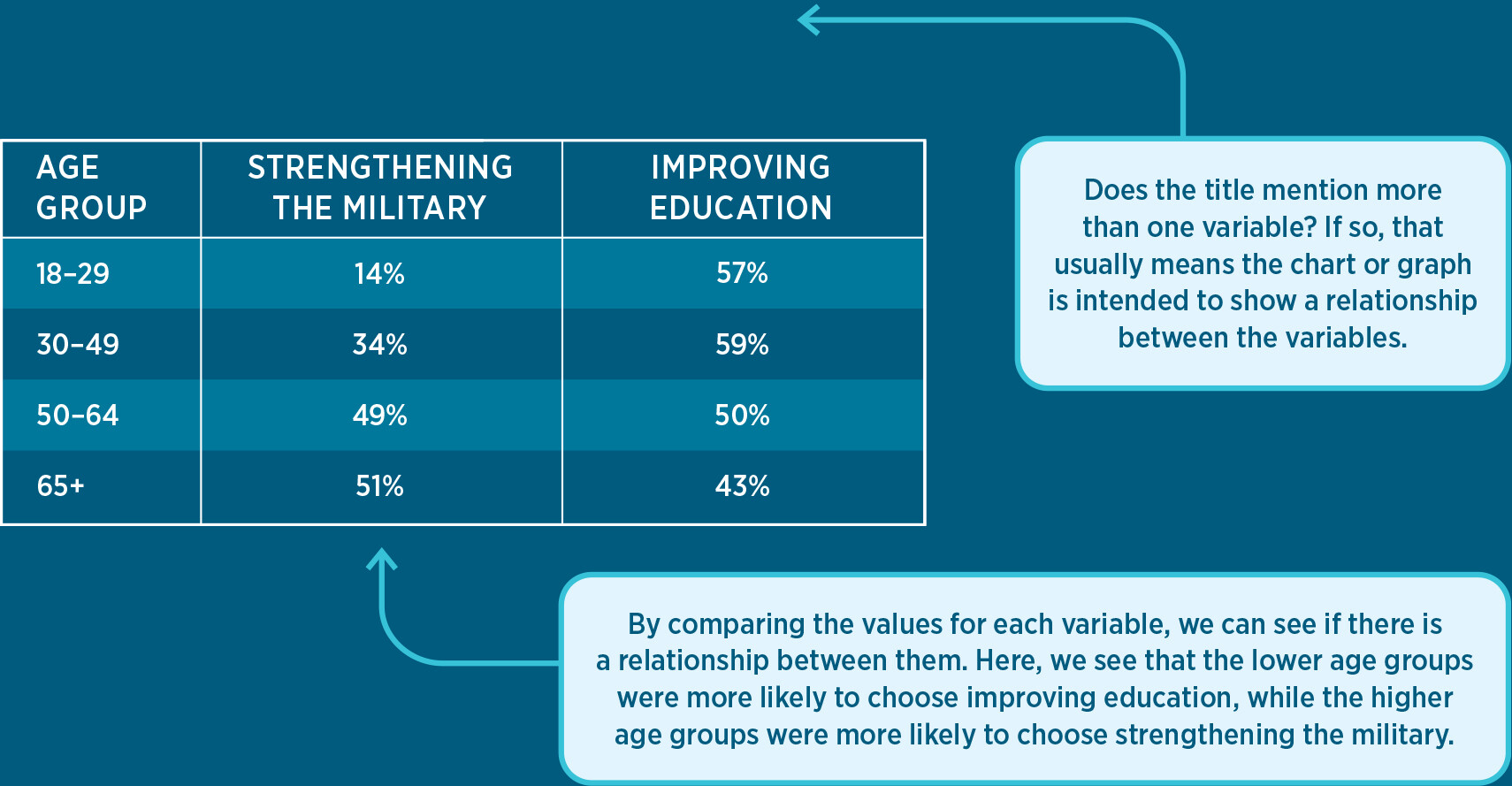
More information
A table displaying Policy Priorities by age group. A subtitle reads, Percent who say that, blank, should be a top priority for the government, with a note specifying that respondents were allowed to pick more than one option. The table is divided into the categories of age group, strengthening the military, and improving education. For the age of 18 to 29, 14 percent say that strengthening the military should be a top priority for the government and 57 percent said that it should be improving education. For the age of 30 to 49, 34 percent say that strengthening the military should be a top priority for the government and 59 percent said that it should be improving education. For the age of 50 to 64, 49 percent say that strengthening the military should be a top priority for the government and 50 percent said that it should be improving education. For the age of 65 plus, 51 percent say that strengthening the military should be a top priority for the government and 43 percent said that it should be improving education.
There are two additional boxes in the graphic that explain important data literacy concepts. The first points to the title of the graph and reads: Does the title mention more than one variable? If so, that usually means the chart or graph is intended to show a relationship between the variables. The second points to the bottom of the table and reads: By comparing the values for each variable, we can see if there is a relationship between them. Here, we see that the lower age groups were more likely to choose improving education, while the higher age groups were more likely to choose strengthening the military.
The first column in Table A displays the values for age group, which in this case are ranges. The other columns provide data about policy priorities; they display the percentage of survey respondents in each age group who said that “strengthening the military” (in the second column) and “improving education” (in the third column) should be among the government’s top priorities. We can compare the columns to determine if there is a relationship between age and policy priorities. We see that a greater percentage of respondents in the higher age ranges said that strengthening the military should be a top priority; in the oldest age group (65+), 51 percent of respondents would have the government prioritize strengthening the military compared to 14 percent in the youngest age group (18–29). In the lower age groups, more respondents said that improving education should be a top priority. This is strong quantitative evidence of a relationship between age and policy priorities, which is the main point.
Step 2: Evaluate the Argument
After you’ve identified the main point of a graph or chart, you should consider: Does the graph or chart make a compelling argument, or are there concerns with how the evidence is presented? Here are some of the questions you should ask when you see different types of graphs.
Is the Range of the y-Axis Appropriate?For a bar graph or line graph, identify the range of the y-axis and consider whether this range is appropriate for the data being presented. If the range of the y-axis is too large, readers may not be able to perceive important fluctuations in the data. If the range is too small, insignificant differences may appear to be huge.
Figures B and C present exactly the same data but on graphs with very different y-axes. Both graphs plot median U.S. household income from 1990 to 2020. In the first graph, the range of the y-axis is so large that it looks like household income has barely changed over the past 30 years. In the second graph, the range is more appropriate. The second graph highlights meaningful changes in a household’s purchasing power over this time period.
Median Household Income over Time
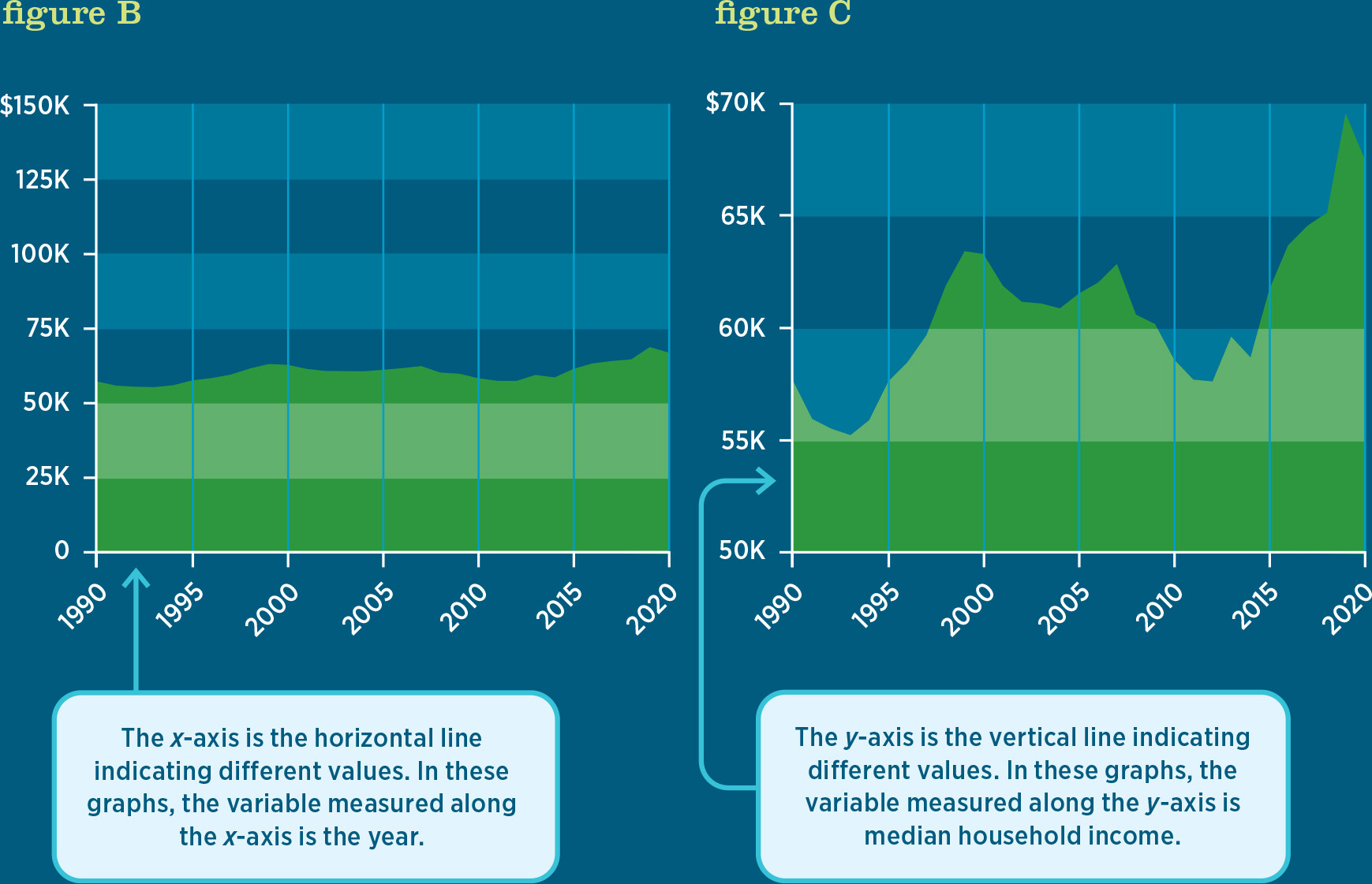
More information
Two area graphs display the same median household income information from 1990 to 2020 using different scales on the y axis. In the first graph, Figure B, the y axis ranges from 0 to 150 thousand dollars in intervals of 25 thousand dollars. The graph does not appear to fluctuate much. The line begins above 50 thousand dollars and rises and falls a small amount before ending just over 60 thousand dollars. The second graph, Figure C, has a y axis that ranges from 45 thousand to 65 thousand dollars in intervals of 5 thousand dollars, and though it displays the same data as Figure B, the changes in median income over time are much more apparent. The graph drops sharply at the beginning, then rises steeply and plateau from a little before 2000 to about 2008, where it has another sharp drop before climbing to a high peak in 2018.
There are two additional boxes in the graphic that explain important data literacy concepts. The first box points to the x axis on Figure B and reads: The x axis is the horizontal line indicating different values. In these graphs, the variable measured along the x axis is the year. The second box points to the y axis on Figure C and reads: The y axis is the vertical line indicating different values. In these graphs, the variable measured along the y axis is median household income.
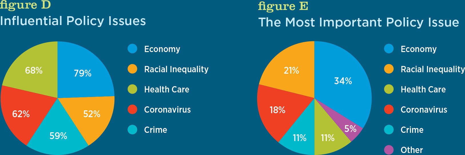
Is the Graph a Good Match for the Data?Different types of graphs are useful for different types of data. A single variable measured over a long period of time is often best visualized using a line graph, whereas data from a survey question for which respondents can choose only one response option might best be displayed with a bar graph. Using the wrong type of graph for a data set can result in a misleading representation of the underlying data.
For example, in the 2020 presidential election, pollsters were interested in measuring the importance of various policy issues to voters. Some surveys asked respondents how important each of a series of policy issues would be to their vote decision—for example, “How important, if at all, are each of the following issues in making your decision about who to vote for in the 2020 presidential election?” Other surveys listed a set of policy issues and asked respondents to select which one of them was the single most important factor in their vote decision. Both approaches captured the importance of different policy issues to vote choice, but they did so in different ways.
Figures D and E are pie charts that illustrate the data from two surveys. The difference in how the graphs portray the importance of, say, health care to voters is striking. The first graph, “Influential Policy Issues,” based on the survey in which respondents were asked to select all issues that were very important to them, indicates that health care is an important factor for 68 percent of the voters surveyed. In contrast, the second graph, “The Most Important Policy Issue,” shows that when respondents were asked to select one policy issue from the given options, only 11 percent selected health care as the most important factor for their vote choice.
Top Policy Priorities, 2020
More information
Figure D, A pie chart titled Influential Policy Issues has 5 segments. The responses are as follows:
Economy: 79 percent
Racial Inequality: 52 percent
Health Care: 68 percent
Coronavirus: 62 percent
Crime: 59 percent
Figure E, A pie chart titled The Most Important Policy Issues has 6 segments. The responses are as follows:
Economy: 34 percent
Racial Inequality: 21 percent
Health Care: 11 percent
Coronavirus: 18 percent
Crime: 11 percent
Other: 5 percent
This example demonstrates why a pie chart is a poor graph choice for a variable in which the response categories do not add up to 100 percent. In choosing what type of graph to use, researchers and authors have to make thoughtful decisions about how to present data so the takeaway is clear and accurate.
Does the Relationship Show Cause and Effect—or Just a Correlation?If a graph or chart conveys a relationship between two or more variables, it is important to determine whether the data are being used to make a causal argument or if they simply show a correlation. In a causal relationship, changes in one variable lead to changes in another. For example, it is well established that, on average, more education leads to higher earnings, more smoking leads to higher rates of lung cancer, and easier voter registration processes lead to higher voter turnout.
Other times, two variables might move together, but these movements are driven by a third variable. In these cases, the two variables are correlated, but changes in one variable do not cause changes in the other. A classic example is the relationship between ice cream consumption and the number of drowning deaths. As one of these variables increases, the other one does too, but not because one variable is causing a change in the other one—both variables are driven by a third variable. In this case, that third variable is temperature (or season). Both ice cream consumption and drowning deaths are driven by increases in the temperature because more people eat cold treats and go swimming on hot days.
There are many examples of data that are closely correlated but for which there is no causal relationship. Figure F displays a line graph of two variables: the number of letters in the winning word of the Scripps National Spelling Bee and the number of people killed by venomous spiders. The two variables are strongly correlated (80.6 percent), but it would be wrong to conclude that they are causally related. A causal relationship requires theoretical reasoning—a chain of argument linking cause to effect. Distinguishing causal relationships from mere correlations is essential for policy makers. A government intervention to fix a problem will work only if that intervention is causally related to the desired outcome.
figure F Number of Letters in Winning Word of Scripps National Spelling Bee Correlates with Number of People Killed by Venomous Spiders
Step 3: Consider the Source
In addition to making sure you understand what a data graphic says, it’s important to consider where the data came from and how they were collected.
- What is the source of the data? Good graphs should have a note citing the source. In the United States, reliable sources include government agencies and mainstream news organizations, which generally gather data accurately and present them objectively, as in Figure G. Data from individuals or organizations that have specific agendas, such as interest groups, should be more carefully scrutinized.
figure G Voter Registration Rates by Age, 2022
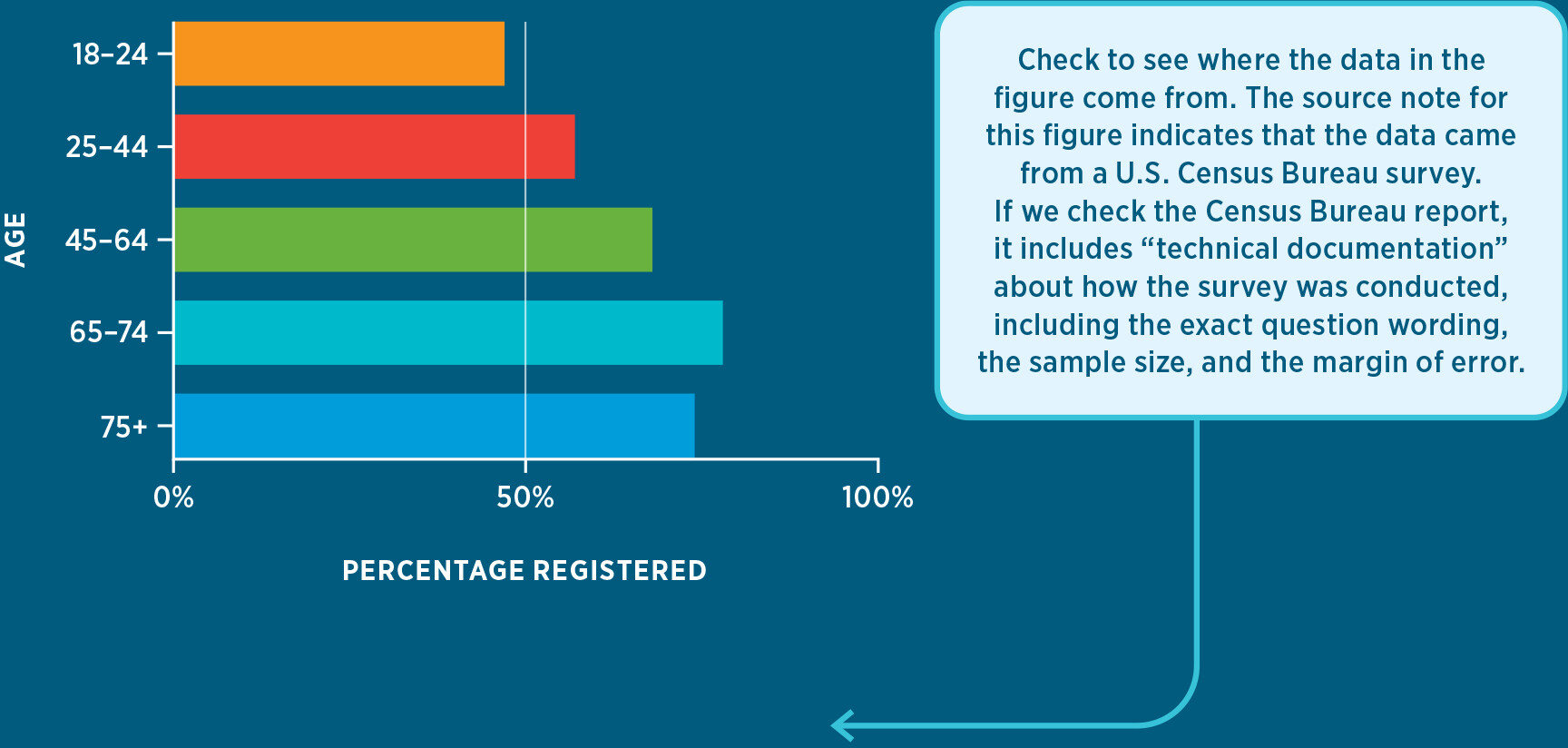
More information
A bar chart shows the percentage of eligible voters who were registered to vote in 2022, divided by age group. The y axis displays age groups and the x axis displays the percentage of voters registered in each group. The data is as follows:
18 to 24: around 45 percent
25 to 44: around 60 percent
45 to 64 years: around 72 percent
65 to 74 years: around 78 percent
75 plus: around 75 percent
There is an additional box in the graphic that explains an important data literacy concept. It points to the source listed below the graph and reads: Check to see where the data in the figure come from. The source note for this figure indicates that the data came from a U.S. Census Bureau survey. If we check the Census Bureau report, it includes “technical documentation” about how the survey was conducted, including the exact question wording, the sample size, and the margin of error.
SOURCE: U.S. Census Bureau, “Voting and Registration in the Election of November 2022,” Table 2, All Races, www.census.gov/data/tables/time-series/demo/voting-and-registration/p20-583.html (accessed 5/30/24).
SOURCE: U.S. Census Bureau, “Voting and Registration in the Election of November 2022,” Table 2, All Races, https://www.census.gov/data/tables/time-series/demo/voting-and-registration/p20-586.html (accessed 5/30/24).
- Is it clear what is being measured? For example, in a poll showing “Support for Candidate A,” do the results refer to the percentage of all Americans? The percentage of likely voters? The percentage of Democrats or Republicans? A good data figure should make this clear in the title, in the labels for the variables, and/or in a note.
- Do the variables capture the concepts we care about? There are many ways, for example, to measure whether a high school is successful (such as math scores, reading scores, graduation rate, or parent engagement). The decision about which variables to use depends on the specific question the researcher seeks to answer.
- Are survey questions worded appropriately? If the graph presents survey data, do the questions and the answer options seem likely to distort the results? Small changes in the wording of a survey question can drastically alter the results.
- Are the data based on a carefully selected sample? Some data sets include all individuals in a population; for example, the results of an election include the choices of all voters. Other data sets use a sample: a small group selected by researchers to represent an entire population. Most high-quality data sources will include information about how the data were collected, including the margin of error based on the sample size. (“Measuring Public Opinion” in Chapter 10 provides more information on sampling and other factors that affect the reliability of polls.)
SOURCES FOR OTHER FIGURES IN THIS SECTION:
|
Figure A |
Gallup, https://news.gallup.com/poll/15370/party-affiliation.aspx (accessed 5/30/24). |
|
Table A |
Pew Research Center, “Economy and COVID-19 Top the Public’s Policy Agenda for 2021,” January 28, 2021, https://www.pewresearch.org/politics/2021/01/28/economy-and-covid-19-top-the-publics-policy-agenda-for-2021/ (accessed 5/30/24). |
|
Figures B, C |
U.S. Census Bureau (via Federal Reserve Bank of St. Louis), https://fred.stlouisfed.org/series/MEHOINUSA672N (accessed 5/30/24). |
|
Figure D |
Pew Research Center, “Important Issues in the 2020 Election,” August 30, 2020, https://www.pewresearch.org/politics/2020/08/13/important-issues-in-the-2020-election/ (accessed 5/30/24). |
|
Figure E |
NBC News, “Highlights and Analysis from Election Day 2020,” January 6, 2021, https://www.nbcnews.com/politics/2020-election/live-blog/election-day-2020-live-updates-n1245892/ncrd1246088#blogHeader (accessed 5/30/24). |
|
Figure F |
Spurious Correlations, https://www.tylervigen.com/spurious-correlations (accessed 5/30/24). |
Endnotes
- Respondents were allowed to pick more than one option. Return to reference *