working it out 1.2


Reading a Graph
Scientists often convey complex information and mathematical patterns in graphical form. Graphs typically have two axes: a horizontal axis (the x-axis) and a vertical axis (the y-axis). The x-axis usually shows an independent variable, the one a researcher might have control over in an experiment, whereas the y-axis shows the dependent variable, which is typically the variable a researcher is studying.
Graphs can take different shapes. Suppose we plot the distance a car travels over time, as shown in Figure 1.7a. In a linear graph, each interval on an axis represents the same-sized step. Each step on the horizontal axis of the graph in Figure 1.7a represents 5 minutes. Each step on the vertical axis represents a distance of 5 km traveled by the car. Data are plotted on the graph, with one dot for each observation; for example, after 20 minutes, the car has traveled 20 km.
Drawing a line through those data indicates the trend (or relationship) of the data. To understand what the trend means, scientists often find the slope of the line, which is the relationship of the line’s rise along the y-axis to its movement along the x-axis. To find the slope, we look at the change between two points on the vertical axis divided by the change between the same two points on the horizontal axis. For example, finding the slope of the line gives
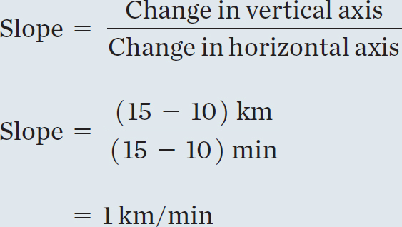
There, the trend tells us that the car is traveling at 1 kilometer per minute (km/min), or 60 kilometers per hour (km/h).
Many observations of natural processes do not yield a straight line on a graph. When you catch a cold, for example, you feel fine when you get up in the morning at 7 a.m. At 9 a.m. you feel a little tired. By 11 a.m. you have a bit of a sore throat or a sniffle and think, “I wonder whether I’m getting sick,” and by 1 p.m., you have a runny nose, congestion, fever, and chills. The illness progresses faster with each hour as time goes by. That process is exponential because the virus that has infected you reproduces exponentially.
For the sake of this discussion, suppose that the virus produces one copy of itself each time it invades a cell. (Viruses actually produce 1000–10,000 copies each time they invade a cell, so the exponential curve is much steeper.) One virus infects a cell and multiplies, so now two viruses exist—the original and a copy. Those viruses invade two new cells, and each one produces a copy. Now four viruses are there. After the next cell invasion, we have eight. Then 16, 32, 64, 128, 256, 512, 1024, 2048, and so on. That behavior is plotted in Figure 1.7b.
Seeing what’s happening in the early stages of an exponential curve can be difficult because the later numbers are so much larger than the earlier ones. That’s why we sometimes plot that type of data logarithmically, by putting the logarithm (roughly the exponent of the 10 in scientific notation) of the data on the vertical axis, as shown in Figure 1.7c. Now each step on the axis represents 10 times as many viruses as the previous step. Even though we draw all the steps the same size on the page, they represent different-sized steps in the data (for example, the number of viruses). We often use that technique in astronomy because it has a second, related advantage: very large variations in the data can easily fit on the same graph.
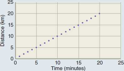
a. The relationship between time and distance traveled.
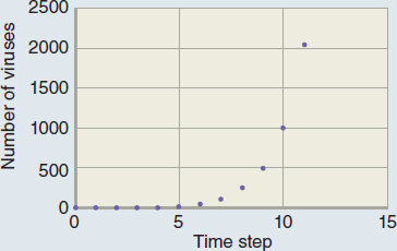
b. The relationship between time and number of viruses.
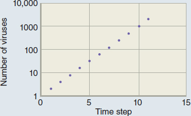
c. The data in part b. plotted logarithmically.
Each time you see a graph, you should first understand the axes—what data are plotted on the graph? Then you should check whether the axes are linear or logarithmic. Finally, you can look at the actual data or lines in the graph to understand how the system behaves.
 Answer